A mark with
a little room.
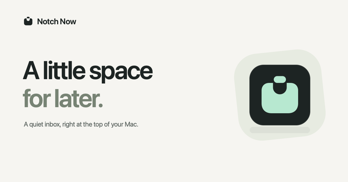
A thought, held for later. A small pocket. A familiar notch. One simple shape that carries the whole idea.
Download the brand kit

The essentials.


Prefer PNG? App icon · Favicon · Touch icon



The website palette.
White#FFFFFF
Silver#F5F5F7
Graphite#1D1D1F
Grey#515154
Muted#6E6E73
Hairline#D2D2D7
Blue#0066CC
Charcoal#161617
White and silver make room for the product. Blue identifies website actions; mint remains in the app icon and its feedback. Primary buttons use #0071E3 with white text; focus on dark surfaces uses #2997FF.
The product identity.
Ink#1D2423
Paper#F3F5F2
Mint#B7E8D0
Spruce#0A241E
These colours belong to the product identity and the downloadable assets. Mint marks a small moment of feedback in the app. Use the ink mark on light backgrounds and the mint mark on dark backgrounds. Give the mark at least one capsule’s height of clear space.